
Data visualization has evolved into one of the most powerful levers for decision-making.
In boardrooms and operations reviews alike, the quality of insight is defined by the quality of visualization. As organizations scale, their questions become more multidimensional, and the limits of basic charts become increasingly visible. Leaders today require visual intelligence that can explain relationships, highlight risk, and uncover patterns that traditional dashboards cannot express.
In my role leading Data and AI programs, I see one consistent truth: advanced visualization is not about visual complexity. It is about revealing the structure behind decision-making, flows, dependencies, hierarchies, correlations, and behavioral patterns. When visualization matures, decision maturity follows.
When leaders need a view that cuts through noise and exposes what truly drives outcomes, these are the visualization methods I count on. Before the right visualization can be chosen, it helps to be clear on the types of data analytics your business question is actually asking, whether that is understanding what happened, why it happened, or what should happen next.
1. Network Graphs: Exposing Dependencies That Influence Outcomes
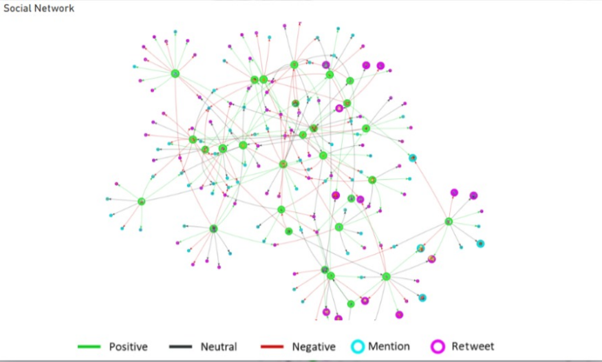
Organizations operate as complex networks. Patients, clinicians, departments, suppliers, referral patterns, and cost centers influence one another in ways that traditional dashboards rarely capture.
Network graphs bring these interconnections into view, highlighting relationships that shape real outcomes.
Leading Data and AI initiatives, I rely on network graphs to guide teams in understanding the forces behind performance. They provide clarity on how decisions in one area ripple across the system and influence results elsewhere.
Network graphs help me surface insights that matter most:
- Identify hidden influencers that impact clinical, operational, or financial outcomes
- Detect bottlenecks that restrict workflow efficiency
- Reveal natural clusters and communities that explain patterns of behavior
- Map cause-and-effect pathways to show how decisions propagate across functions
- Highlight interruptions and inefficiencies that remain invisible in standard reports
How I use them to support enterprise decision-making:
- I help leadership visualize referral flows to detect leakage and optimize coordination
- I guide teams in analyzing care delivery networks to balance workload and resource allocation
- I expose procurement and supply-chain dependencies to reduce operational risk
- I clarify cross-department impact paths so teams can anticipate consequences before they occur
By bringing these interconnections into focus, network graphs shift conversations from isolated metrics to systemic understanding. This clarity allows leaders to make better-informed, more strategic decisions and drives meaningful transformation across the organization.
From Siloed Hospital Data to a Real-Time Command Center
2.4M+ patient encounters. Zero real-time visibility. CaliberFocus changed that, one Microsoft Fabric deployment, one unified intelligence layer, zero blind spots.
2. Sankey Diagrams: Mapping What Moves and Where Value Gets Lost
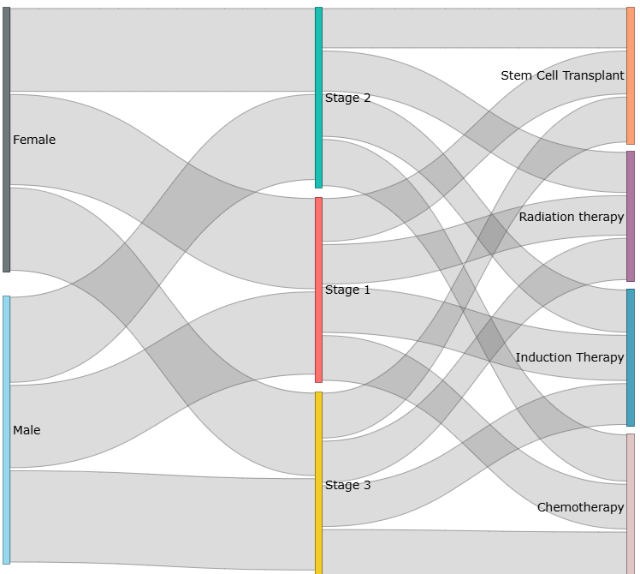
Every system involves movement, of information, patients, materials, work, and resources. Sankey diagrams make these flows visible, revealing how they progress through each stage and where inefficiencies emerge.
When applied thoughtfully, Sankey visualizations provide teams with a clear understanding of leakage, rework, bottlenecks, and hidden complexity within multi-step processes. The insights they uncover allow leaders to redesign pathways, reduce friction, and align costs more effectively with outcomes.
Strategic insights enabled by Sankey diagrams:
- Pinpoint areas where resources or time are being lost and assess operational impact
- Identify stages with concentrated rework or delays that affect downstream outcomes
- Expose multi-step dependencies that are otherwise difficult to quantify
- Highlight intervention points with the greatest potential for value creation
- Guide teams in streamlining workflows and improving cross-functional coordination
By revealing the underlying flow of critical elements, Sankey diagrams turn complex operational processes into actionable intelligence. For leadership, this clarity supports informed decisions, targeted interventions, and measurable improvements in organizational performance.
3. Tree Maps & Sunburst Charts: Making Hierarchy Measurable
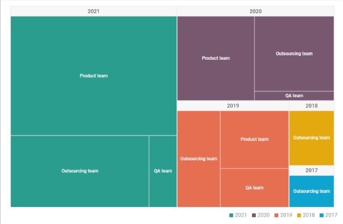
Organizations operate through multiple layers, service lines, portfolios, product categories, regions, cost centers, and operational teams. I turn to tree maps and sunburst charts when I want to help teams measure these hierarchies and present complex structures in a way that leadership can immediately grasp.
These visualizations reveal areas of concentration, imbalance, and growth or decline within multi-layered datasets. By compressing complexity into a structured, actionable view, they allow leaders to quickly understand key insights and make informed decisions.
The above visualizations are mostly standard across all Business Intelligence tools and can used for the right business use case. There are other ways of creating custom visualizations that can come in very handy for specific business requirements and can add a lot of value for the dashboards.
Different Business Intelligence platforms use different ways of creating custom visuals.
4. HTML Content: Dynamic Narrative Intelligence
Organizations need more than charts. They need interpretation. HTML Content embeds rich, DAX-driven narrative directly into reports:
- Real-time alerts: “Revenue down 12% in Region A due to pricing pressure—recommend strategy adjustment”
- Dynamic summaries: Executive insights responding to data changes
- Compliance documentation: Embedded methodology and regulatory context
- Branded storytelling: Beyond native Power BI styling
Leading implementations, I’ve used HTML Content to transform dashboards from static reporting to interactive decision support, charts + automated narrative = complete context.
Further when we have images embedded within simple charts, HTML Content could be your go to for achieving this. When simple visuals need richer context without cluttering the canvas, HTML Content seamlessly integrates images into the decision flow.
5. Deneb (Microsoft Recommended)
Standard visuals limit complex decisions. Deneb creates bespoke visualizations using Vega-Lite JSON:
Why Deneb dominates:
- Pixel-perfect control: Every element customized
- Native rendering: No dependencies, works in any Power BI client
- Full interactivity: Filtering, drilling, cross-highlighting
- Beyond standard charts: 5+ data dimensions, combined chart types
My Deneb applications:
- Custom Sankey diagrams with embedded annotations
- Multi-dimensional performance bubbles (revenue + margin + growth + risk)
- Actuals vs Forecast with variance heatmaps
- Hierarchical flowcharts with real-time binding
Leading implementations, In complex enterprise scenarios where standard visuals keep hitting design limits, Deneb becomes the precision instrument in the toolkit.
In one of my recent implementations, I needed a strictly pixel-perfect waterfall chart—specific bar widths, exact label placement, custom color logic for drivers vs drags, and a very particular way of displaying subtotals. No out-of-the-box visual could get close.
- With Deneb, I was able to design that waterfall exactly as envisioned:
- Every bar aligned to brand guidelines
- Variances encoded with custom rules, not defaults
- Subtotals and intermediate steps displayed with tailored shapes and annotations
- Tooltips and interactivity crafted to match how executives actually read the chart
What started as “Power BI can’t do this” turned into “This is exactly what we wanted, and more.”
That’s the real power of Deneb: when the decision demands a very specific visual language, it lets you stop compromising with templates and start designing the chart your business truly needs.
HTML Content & Deneb: Microsoft-Recommended Custom Visualization Power
Advanced charts need context. HTML Content and Deneb both Microsoft-certified unlock Power BI’s full potential.
Why Advanced Visualization Fails Without the Right Foundation
Advanced visualization has the power to transform decision-making, but it rarely succeeds in isolation. Over time, I have observed that even the most sophisticated charts or dashboards deliver limited value when the underlying data ecosystem is fragmented, inconsistent, or poorly structured. Without a solid foundation, insights remain superficial, adoption is uneven, and strategic impact is muted.
Over the years, I have identified four key foundational gaps that frequently limit outcomes:
1. Fragmented or ungoverned data
Visualization becomes unstable when the supporting data lacks quality, lineage, or consistency.
Establishing governed, high-quality data foundations ensures that insights are accurate, trustworthy, and actionable.
2. Legacy BI platforms that restrict insight depth
Modern visualization requires performance, flexibility, and scale.
Modern visualization demands performance, flexibility, and scale that legacy platforms simply cannot deliver, which is why cloud data modernization is often the prerequisite step before any advanced BI investment makes sense.
3. Absence of structured BI standards
Advanced visuals need design discipline.
Through our visualization design frameworks, we ensure clarity, comparability, and executive-grade interpretation.
4. Incomplete change management
Insight fails when adoption fails.
Our OCM programs ensure teams adapt, trust, and operationalize new intelligence models.
Advanced visualization is not a design activity. It is a data architecture, engineering, governance, and user-adoption outcome. Once those pillars strengthen, visualization becomes an enterprise asset.
How I Approach Advanced Visualization for Strategic Impact
My approach always begins with the decision, not the chart type. I work to understand the business question, the risk associated with it, and the operational levers that influence it. From there, the visualization is chosen to expose what leaders need to see: structure, flow, imbalance, correlation, or pattern behavior.
With the CaliberFocus framework, this becomes repeatable and scalable:
- A BI strategy and roadmap tied directly to business priorities
- A modern analytics platform capable of supporting advanced visuals
- A streamlined BI ecosystem through rationalization and standardization
- A robust semantic layer that ensures one source of truth
- High-caliber visualization design grounded in decision science
- Organizational enablement that ensures sustainable adoption
This structured approach turns visualization into a strategic capability, not an isolated reporting function.
Mid CTA 2nd:The gap between a good decision and a great one is not strategy.
It is how fast your data moves.
Final Perspective
Leaders today operate in environments defined by complexity. Decisions require more than historical reporting, they require depth of interpretation and the ability to see patterns before they become problems. Advanced visualization is the gateway to that depth.
In my view, organizations that embrace advanced visual intelligence gain a structural advantage. They make faster decisions, allocate resources more accurately, and operate with greater confidence. At CaliberFocus, our mission is to help enterprises build this capability with the rigor, architecture, and precision required for long-term success.

Antony Savari
Senior Vice President – Data & AI
Antony brings more than two decades of dedicated expertise in Information Technology and Data Analytics. His spans hands-on engineering to enterprise strategy, with deep experience across SAP Analytics and cloud-native data ecosystems. Known for building robust data cultures and guiding enterprises through AI transformation, he combines technical depth with visionary leadership to help organizations turn data into lasting business impact.